Every year we look back at our web design to see what did and did not work from the previous year. Since it’s a technology-based field, it’s always morphing and changing; and we’re always updating our working habits as a result. Here are some web design trends that will emerge in 2023 that were either already trending or 2022 set in motion.
Table of Contents
The Web Gets Dark Mode
Over the last few years operating systems have been adding “dark mode” to their systems. This was for users that prefer working on a darker color palette. “Dark mode” can be great for users who are working in low-light conditions. Users that are working with graphics or video that can be easier to see on dark surfaces all gain an advantage.
Sometimes “dark mode” can be easier for eyes. Many times, however, it can be more difficult for our eyes to see light on dark for long periods of time. You may start seeing more switches on websites that allow you to view the site more comfortably based on your preferences. Other sites may opt to adjust based on the preferences you have set on your device.
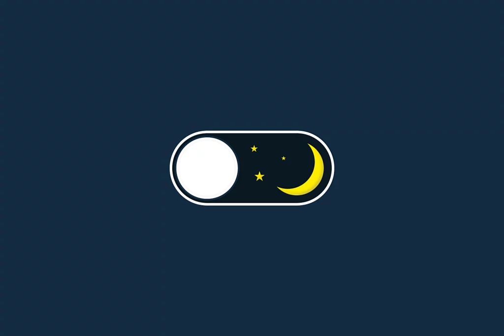
The next year should bring about more “dark mode” experiences allowing you to view sites in a way that can be more visually appealing. Even though this may be a trend, don’t expect it to be the default when you go to websites. You may need to look for a button that you can switch.
Neumorphic Design
This trend started a couple of years ago as designers started trying to find a happy medium between “flat design” and “skeumorphism”.
Flat Design is a design style commonly used in graphical user interfaces that emphasizes less detail. It is more of a representation of the physical object. Few shadows, if any, are used and most flat designs focus on a singular dimension.
Skeumophism focuses on creating a representation of a real object in a more accurate way. Objects appear 3D and have color schemes that match the real-world object. Skeumophism has been used in many types of design including graphical user interface design.
Neumorphism focuses on creating a representation of a real-world object. It also tries to maintain much of the practicality of “flat design”. A pencil, for example, may look 3D, with proper shadows and coloring. The wood grain would not show to maintain the simple “flat” appearance. Many neumorphic designs use drop shadows and have an opposing shadow which would usually be an opposing color. Very smooth gradients are generally used in neumorphic design also.
Expect web designers to start incorporating many elements of neumorphism into their designs in the coming year. Buttons may start to pop a little more as they use a more 3D look. Canvas areas may start seeing buttons or switches that may seem to be attached to them.
3D Object, Abstract Designs & Composites
High quality photos are a great way to showcase a product. Expect many designs to start incorporating 3D renders and objects into their designs also. This can add another dimension to an otherwise standard design. Also, expect abstracts and bold color choices as accents to make certain elements stand out.
There will also be opportunities to take a standard photo and composite three-dimensional design elements or abstract designs into the photos. This can throw an extra bit of splash to a page design. These extra bits add a sense of boldness especially on an otherwise muted color palette.
Yellow with green, red or orange can be very difficult to process for those that are colorblind. Purple should not be used with similar shades of blue. #AccessibilityWebDesign
Movement Marketing For A Cause
Another trend for web design, but also marketing in general, is Movement Marketing. This is where a product, service, or company attaches itself to a cause that people care about. This isn’t just for marketing purposes. The companies usually are attaching themselves to movements that they already align with.
Animation & Better Parallax
A few years ago, parallax was a web design trend. Unfortunately, like many new things it wasn’t implemented well. Many sites created pages that didn’t navigate well because they wanted to jump on the trend. Since then, there has been much experimentation with parallax and animation on websites. Small micro-animations that draw attention along with subtle movement on the homepage can create an effect that draws a user’s eye without distraction.
Animation can also be used to transition between sections of a page. For example, Apple uses parallax animation to help guide users down its pages, such as their iPhone page. Look for this to be a trend as more tools to help perform this type of animation become available.
What is Parallax?
In web design, parallax is a scrolling animation where background images move at a different speed than foreground images when the user scrolls the page.
Site Speed
Having a fast site has always been important for Search Engine Optimization (SEO) as well as user experience. What makes this a trending topic for the upcoming year is several reasons.
Google – In 2022, Google started changing the way it crawls sites, prioritizing smartphone indexing. That means it wants to see sites that have prioritized mobile experience in layout and usability, but also speed. Mobile connections have traditionally been slower than wifi connections so optimizing a mobile site for speed has always been important. Even though cellular speeds have improved, some areas have not been upgraded to the latest technologies yet.
Multi-tasking – This year especially, many users have begun using multiple applications and websites together with streaming video. Because of this, users are having to adjust their workflows to deal with the added bandwidth they previously didn’t need. A streamlined site that is fast can help those users by having their website content available when needed.
Balanced Web Design
Making a splash in 2023 means striking a balance of bold with calm and muted. Use 3D elements as accents to highlight areas. Use bright and bold colors in an abstract design to catch user attention. However, with all this keep in mind that your users also need a balance where your base color schemes can be more muted and calming.
Align your site with a movement and adapting a color scheme that works for that movement can also extend your marketing arm in a new direction. As always, keep site speed in mind especially as Google starts to prioritize mobile devices. Site speed will also be important as users start to experience the beginning of a new generation of cellular technology. As you think through designing for 2023, keep the focus on users.
Bonus Trend: Bold Fonts
The past few years have seen a trend toward using a variety of fonts. This is partially due to the availability of a larger database of fonts that can be used on a website. Google Fonts have allowed web designers an easier way to implement a variety of type choices on their sites. Designs have started using bolder fonts to emphasize elements and also to give some contrast where needed.