Minimalism

For Example: A law firm could benefit from a minimalist design to convey professionalism and clarity. By reducing clutter and using white space effectively, the firm’s website can highlight key services and credentials without overwhelming visitors.
For Example: A law firm could benefit from a minimalist design to convey professionalism and clarity. By reducing clutter and using white space effectively, the firm’s website can highlight key services and credentials without overwhelming visitors.
Typography

For Example: A fashion retailer might use a bold, stylish font for headings and a clean, readable font for body text, creating a sophisticated and cohesive look that aligns with their brand identity.
For Example: A fashion retailer might use a bold, stylish font for headings and a clean, readable font for body text, creating a sophisticated and cohesive look that aligns with their brand identity.
Content

For Example: A financial advisor’s website, for example, should have clearly defined sections for services, client testimonials, and educational resources, making it easy for potential clients to find the information they need.
For Example: A financial advisor’s website, for example, should have clearly defined sections for services, client testimonials, and educational resources, making it easy for potential clients to find the information they need.
Video Content
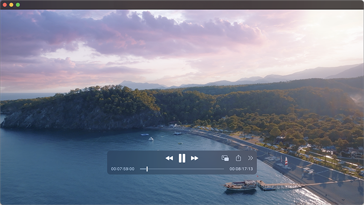
Incorporating high-quality videos to tell your story and engage users.

For Example: A travel agency could use videos to showcase exotic destinations, customer testimonials, or travel tips, creating an immersive experience that inspires visitors to book their next vacation.
For Example: A travel agency could use videos to showcase exotic destinations, customer testimonials, or travel tips, creating an immersive experience that inspires visitors to book their next vacation.
3D Elements
For Example: An online tech store could use 3D product renderings to give customers a more interactive and detailed view of gadgets, enhancing the shopping experience and increasing the likelihood of purchase.
For Example: An online tech store could use 3D product renderings to give customers a more interactive and detailed view of gadgets, enhancing the shopping experience and increasing the likelihood of purchase.
Interactive Design

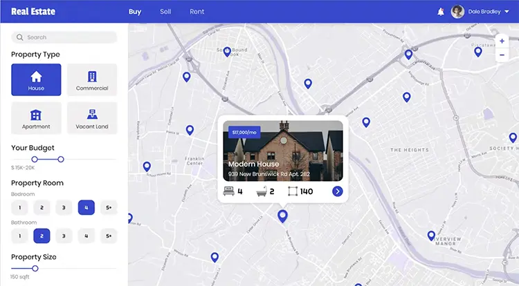
For Example: A real estate website could use an interactive map to show property listings, allowing users to explore neighborhoods and view homes with ease. Adding a chatbot can also help answer common questions and guide users through the home buying process.
For Example: A real estate website could use an interactive map to show property listings, allowing users to explore neighborhoods and view homes with ease. Adding a chatbot can also help answer common questions and guide users through the home buying process.
High-Resolution Photography
Using professional-quality images that are crisp, clear, and well-composed is critical. Investing in professional photography can create a lasting impression.

For Example: A restaurant could use high-resolution photos of their dishes and dining ambiance to entice customers and convey the quality of their dining experience.
For Example: A restaurant could use high-resolution photos of their dishes and dining ambiance to entice customers and convey the quality of their dining experience.
Custom Illustrations

For Example: A tourist attraction could use whimsical illustrations to add charm and character to their website, making it more engaging for both kids and parents.
For Example: A tourist attraction could use whimsical illustrations to add charm and character to their website, making it more engaging for both kids and parents.
By combining these trends with your unique brand identity, your website can stand out from the competition and deliver an exceptional user experience. For a new website that capitalizes on these trends and enhances your brand, contact Dot Marketing for a quote!
